Introduction
Code components (also referred as PCF Controls) are a great way to enhanced the user experience of Model-Driven Apps and Canvas Apps while developing in a “sandbox” that guarantees the support of your customizations by Microsoft.
Unfortunately the development of web controls can be very tedious and can require a lot of effort. The return on investment can be difficult to get in companies that are not ISV and are therefore not selling their controls.
That is why I usually prefer using a framework and/or a library to accelerate the development of such controls. Kendo UI for React is one of those component libraries that I appreciate and that I use in conjunction with PCF to quickly create complex code components for Model-Driven Apps.
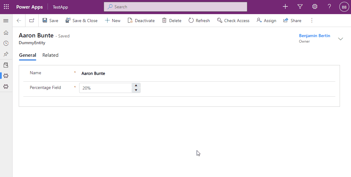
In this post I will demonstrate how to create a code component that displays a number field with a percentage format, something that is unfortunately not supported out of the box by Model-Driven App and Dataverse. I will demonstrate how to use Power Apps Component Framework (PCF) to create the control and Kendo UI for React to ease the development of the input itself.
The full source code can be found here: Wawawum/samples-pcf-kendo: Samples about building PCF Controls with Kendo React (github.com)
Disclaimer about Kendo
I am not affiliated to Kendo in any way. I genuinely enjoy working with their components and think it may give you ideas or help you starting a PCF project with Kendo React. Please note that Kendo is not free. You have to purchase a commercial license or use a trial license.
Disclaimer about Canvas App
Code components can be used in Model-Driven Apps and Canvas Apps. Although most of the code is exactly the same some minor implementation details still persist.
I won’t take into account those differences in this post. The code and explanations I provide are only tested in a Model-Driven App context for the following reason: I do not like Canvas App at all (that will certainly be discussed in another post).
Prerequisites
If you have never developed a code component before you may have to install some tools before creating a project.
You should refer to this official documentation:
Create your first component – Prerequisites
Creating the project
First we need to create a project. Open a terminal, navigate to an empty folder where the project will be created and run the following command:
pac pcf init --namespace Wawawum --name KendoPercentageControl --template fieldThat should create the required files and folder structure. In the same terminal enter the following command to launch Visual Studio Code with the current directory opened:
code .You can now either continue entering commands in your terminal or open a new terminal in Visual Studio and use it from now on.
First you have to install / restore the nodes packages:
npm installBefore starting messing around with the code I usually prefer to test if the project compiles and if the control is displayed correctly.
Here is the content of my index.ts file (in the KendoPercentageControl folder) that displays the field’s value:
I only made the following changes compared to the initial version created by the pac command:
- A property named container has been added to the KendoPercentageControl class (line 4)
- That property is assigned in the init method (line 24)
- The content of the container is updated to insert the field’s value (line 35)
Then, run the following command to start the test harness:
npm start watchYou should be able to set the field’s value in the Data Inputs section of the test harness and that value should be displayed by the control:
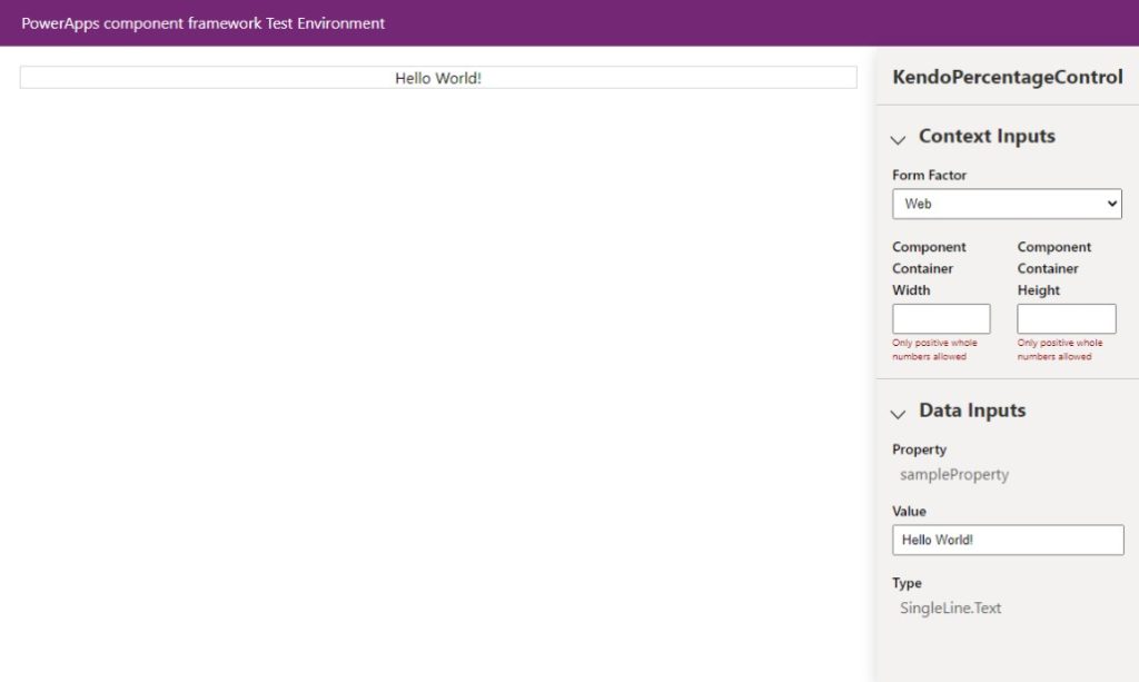
That is great but you will notice the field’s type: SingleLine.Text (displayed at the bottom right corner of the test harness). That is obviously not what we want since we will deal with percentages.
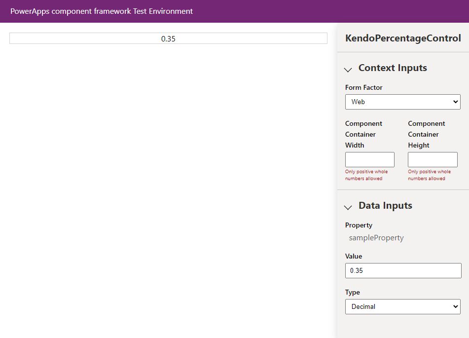
To fix that we need to edit the KendoPercentageControl\ControlManifest.Input.xml file to specify that our control works with decimal, floating point and whole number fields:
You should now see this:
Once you have tested that everything is working has expected you can stop the test harness (Ctrl+C in the terminal).
Creating a React Component
That Hello World component is very limited (for now). Before adding Kendo to our recipe we will add a React Component to our project. That component will be used to render the field while the index.ts file is used to instantiate the React Component and to handle the communication with the Model-Driven App (receiving the field’s properties and value and sending back the updated value).
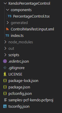
Create a folder named “components” in the KendoPercentageControl folder and create a PercentageControl.tsx file inside it.
For now we will only reproduce the behavior of our Hello World example using a React Component. Here is the content of the PercentageControl.tsx file:
As you can see it is a very simple class component that only uses one prop to get the value to be displayed.
Here is the updated version of the index.ts file:
You will notice an error at line 3 that can easily be fixed by installing the missing types with the following command (VS Code should display a quick fix):
npm i --save-dev @types/react-domBesides the new imports the only thing that has changed is the updateView method that instantiates the PercentageControl component and renders it inside the container.
At that point you should be able to launch the test harness with npm start watch and the control should still display the field’s value.
Adding Kendo to the project
Adding Kendo UI React is quite straightforward and well documented by Progress (the editor of Kendo UI). The controls are bundled into different node packages. The list of packages to install is documented in the control’s documentation page. Here is the one that explains how to use the input controls that we need to display the percentage input (it is actually a number input with a percentage format applied to it):
React Inputs Library Getting Started | KendoReact Docs & Demos (telerik.com)
I will go through the steps so you don’t have to read the official documentation.
Run the following command to install the Kendo UI React packages into the project:
npm install --save @progress/kendo-react-inputs @progress/kendo-react-intl @progress/kendo-drawing @progress/kendo-licensingWe also need to install a theme package. You can choose between those three packages:
- @progress/kendo-theme-default
- @progress/kendo-theme-bootstrap
- @progress/kendo-theme-material
A theme selector is available in the Kendo UI demos so you can easily pick the right theme for you. I will use the bootstrap theme myself and therefore run the following command:
npm install --save @progress/kendo-theme-bootstrapFinally we have to download our license file (kendo-ui-license.txt) and put it in the project’s root directory. If you do not have a license you can sign up for a free trial.
Once the license file is copied you have to run the following commands:
npm install --save @progress/kendo-licensing
npx kendo-ui-license activate
All those required steps to activate the licence are documented here.
Using a Kendo React Component
Now we can start playing with Kendo React Components. The one we need is a NumericTextBox component that is used to display and enter numeric values. Thanks to the formatting options provided by this component we will be able to format the field as a percentage field. You can see a live example here.
Here are the changes made to the PercentageControl.tsx file:
- The Kendo NumericTextBox and NumericTextBoxChangeEvent have been imported (line 2)
- A callback named onChange has been added to the props to communicate the value to index.ts when a change occurs (line 6)
- An onChange function has also been added to handle the onChange event of the NumericTextBox (lines 17-19)
- A constructor has been added in order to bind the onChange function to the instance (lines 11-15). Don’t forget that using arrow functions or bind directly in events is not recommended in React.
- The onChange prop of the NumericTextBox has been assigned to the onChange function of the PercentageControl (line 31)
We also need to update the index.ts file to handle a value change:
- The notifyOutputChanged parameter is saved in a class property (line 30). That will be used to notify the framework that the field’s value has changed.
- The onChange callback has been provided to the PercentageControl (lines 44-47). That callback is used to save the value in a class property when it is updated by the PercentageControl and to call notifyOutputChanged.
- The getOutputs function has been updated to return the field’s value (line 60).
Finally we also neet to tell our PCF control to load the Kendo CSS theme file. That is done by updating the ControlManifest.Input.xml file and adding the CSS path in the resources section:
After building the project and starting the test harness our component should look like this:

If you want to test it in a Dataverse environment you can use the Microsoft PowerPlatform CLI. You will have to authenticate yourself with the following command:
pac auth create --url https://{yourenvironment}.crm.dynamics.com Then, you can deploy the control with the following command:
pac pcf push --publisher-prefix <your publisher prefix>Next steps
Of course I would not recommend using that control in a production environment. Here are some things that should be done:
- Test the control properly
- Customize the CSS in order to better integrate the control with the Model-Driven App look & feel (that would be a good subject for another post right?)
- Fix the width that is currently hard-coded
- The control should be disabled when the field is read only
- Add some properties to the control in order to give some configuration options when adding the component to a form
- Package the control into a managed solution (you can use the Power Platform CLI to do that)
Conclusion
Model-Driven App and Dataverse are obviously targeting companies and teams looking for a low-code / no-code platform but I think the Power Apps Component Framework provides a very promising way of improving the UX of the applications developed with that platform.
Companies that invest in Model-Driven App tend to avoid the development of custom components since they usually invest in such a platform to accelerate the deployment of their solutions while minimizing the costs. Nonetheless, if you really want to ensure user adoption you should not minimize the impact of the user experience and therefore invest in creating components that ease the data entry and implement logic specific to your business.
This is where libraries like Kendo can be very useful to accelerate the development of such components. It is especially true if you choose a React library since the complexity of React components is very well encapsulated.